About Me

My photo
I'm an animator/illustrator living in Vancouver, BC. Please Email me if you want prints of anything or have any questions.

Wednesday, April 21, 2021

Whiskey Face Short

This is a short that I made in 2019.  It made its way around the micro-short festival circuit before the pandemic hit.  here it is:

https://youtu.be/Y5Vx4GOwtPc


Thursday, December 5, 2019


check out my redbubble page.  BUY A SHIRT!!  (or sticker or something geez)

Friday, November 9, 2018

Vikings Night Out

Here is a link to the short i made.  i posted some of the creative process in earlier posts if you care to check them out here or here.


Background design process

When doing the backgrounds for any project, i start with some really rough thumbnails in a notepad.  Then to the board with an equally rough pass just for placement and timing.  then i do a tighter line art clean up pass in Animate CC (formerly flash).  Lastly i take it into photoshop or sketchbook to do the colour.


Same goes with the interior shot.  Though i took some liberties with the simplified background characters when i did the final colour pass.  i wanted to make sure this setup was a nice way to frame the main character - thats why i went with a 1point perspective to draw the eye to the center of the frame.


Rough to clean process

I like to post my process a little bit.  Below are some rough ideas for the character designs for the short "Vikings Night Out".  I usually sketch in a notebook with a regular ball point pen - that way i can keep things loose and not worry about trying to keep a "pretty" sketchbook. after that i'd tighten the design to what i actually want  it to look like as i do the storyboard panels (in blue).  Finally i build the character in its specific poses in Animate CC and choose colors.


Saturday, October 21, 2017

What I've been up to


So its been a long while since i've posted on here.  Do people still use blogger? 
I started an animation podcast with my friend and collaborator Rich Johnson.  its called Beer Friday and you can get it on Itunes or from the Soundcloud page.  OR from the website.  check it out
Oh and i'm working of a few things now, so stay tuned.


Friday, May 22, 2015

Long lost show poster

This is a show poster I made for a band in Ontario.   As it turns out, for a few different reasons, they won't be using the poster... BUT I wanted to post the artwork regardless.


I also made it black and white in 3-D!


here's some back and forth with the rough process too.


Monday, December 29, 2014

I have to see a woman about a horse... painting.

Christmas just came and went and I offered to do a few paintings for my sister-in-law.  One of her horse George, and one of her dog Rudy.  Thanks to an awesome tutorial by CTRL+PAINT that explains how to set brushes properly in photoshop, mixing paints, and managing color palates, I decided to get started.
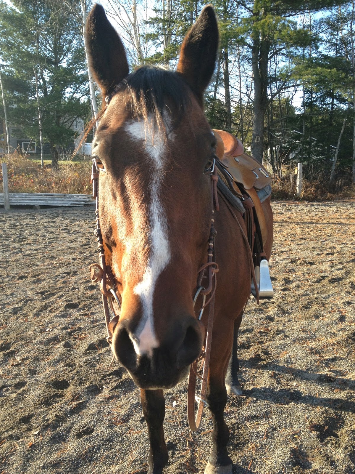

reference pic
Here is the reference pic that I started from.
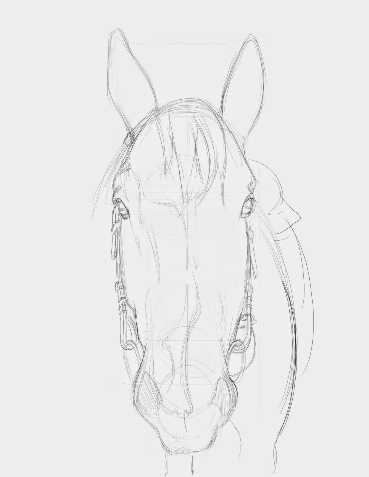


line drawing

Next i did a line drawing in pencil that I will use a painting guide.  I"ll keep it on a separate layer in photoshop while I paint, and then remove it at the end (or keep it to maintain that cool sketchy element to the painting)
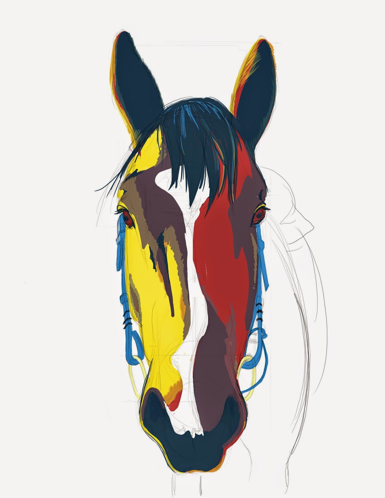


flat colors

Using the palate that i created from the colour of her wall and a picture she has on her walls, I dropped down the flat colors.  This is just a base and can be changed later in the process.  Its a good idea to just throw colour down 1st, then build off of it later.   I wanted to use the purples, reds and blues for the darks and the whites and yellows for the lights.  Later I can mix these paint colours together to get other tones that i need. (explained in the ctrl+paint vids)


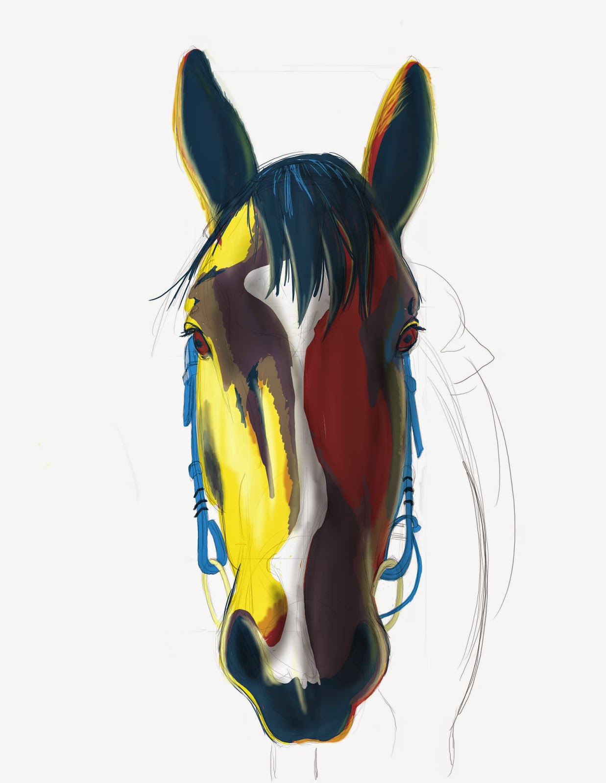
Next i add the soft highs and lows with (mostly) a soft bristled brush with a low opacity and low flow.  This way you can start to get a little bit of depth to the flat graphic tones of the flat color pass.  I also had a chance to darken up the reds at this stage, because they seemed a little light at the initial pass.  BUT be careful at this stage because things can look really mushy and airbrushy if you don't clean it up after this point.  You'll need to add some darker and lighter contrast points with a hard brush to get a bit more of an illustrative result.


At this stage I had the chance to take a hard bristled brush and add some details to the eyes and reins, nostrils and mane.  This is where you can sort of noodle around and cover all your previous mistakes, and have a little more freedom to get the result you are looking for.


This is the final result.  By now I hid the line drawing and threw in a gradient background with purple to compliment the wall that it will be hung on, and blues that I grabbed from the reins to make it pop a bit.  I decided to only render the head, and go for the floating horse head portrait.  That's how George would like it if he could talk.


I also did a portrait of Rudy the dog using the same techniques.  IF i get around to it i'll blog the process later.  Stay tuned.


Thursday, December 11, 2014

Poster art

Here is a poster i did for a show recently.


I"m in a band just to make posters.